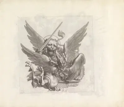
The Next to Be Kicked Out – Dumba’s Master (1916-1917)
Louis RaemaekersFor your project
- Source and licence confirmed before use
- Print-ready master at your wall size
- Adapted to your format and palette on request
SPECIFICATIONS
- Artist
- Louis Raemaekers
- Category
- Illustration
- Year
- 1916-1917
- Nationality / school
- Dutch
- Lifespan
- 1869–1956
- Orientation
- Portrait
- Material
- Digital JPEG + PDF files
- Available sizes
- Print-ready master at your wall size, on request
HELPFUL LINKS
ABOUT THE ARTWORK
Louis Raemaekers is the artist behind "The Next to Be Kicked Out – Dumba’s Master", dated 1916-1917. Illustration, a short history: Illustration serves a text or a story, a tradition that runs from decorated medieval manuscripts to printed book plates, magazines, and posters. Printing methods such as woodcut, engraving, lithography, and photomechanical reproduction each shaped how illustrators worked. About the period around 1916-1917: Dada and Surrealism followed the First World War, the Bauhaus school was founded in 1919, and Art Deco became the fashionable decorative style of the 1920s and 1930s. Posters, magazines, and illustrated books were major ways for the public to meet new art and design. It is listed in the Illustration collection. The image is in portrait orientation.
Buying "The Next to Be Kicked Out – Dumba’s Master" means getting a digital file, not a physical print: Digital JPEG + PDF files, 300 DPI, delivered by email once payment is confirmed. A 300 DPI file is intended for printing at home or at a local print shop, where you can choose a matte, satin, or fine-art paper to suit the room. A portrait format suits narrow wall spaces, hallways, and the area beside a door or window. Illustrative graphics are valued for their decorative line work and narrative quality, which makes them a strong fit for gallery walls, kids rooms, studies, and more intimate interiors. A simple frame with a mat often helps an image settle comfortably into a room. Screens and printers render colour differently, so a small test print is a sensible way to check tones before committing to a large size. Matte and fine-art papers reduce glare in bright rooms, while glossy papers give stronger contrast and deeper blacks. Choosing a standard frame size and printing to fit it often saves the cost of custom framing.
ABOUT THE ARTIST
Dutch, 1869–1956
If you like the visual language of Louis Raemaekers, explore more works by the same artist in our collection.