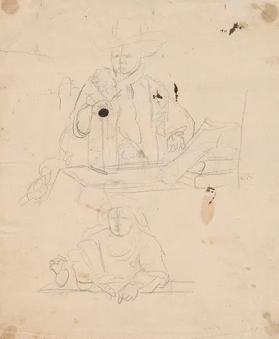
Portret van Wiesken Matthijs (1660)
Moses ter BorchFor your project
- Source and licence confirmed before use
- Print-ready master at your wall size
- Adapted to your format and palette on request
Provenance / Rights
- Rights
- Public domain (artist died 1667)
SPECIFICATIONS
- Artist
- Moses ter Borch
- Category
- Drawings
- Year
- 1660
- Nationality / school
- Dutch
- Lifespan
- 1645–1667
- Orientation
- Portrait
- Material
- Digital JPEG + PDF files
- Available sizes
- Print-ready master at your wall size, on request
HELPFUL LINKS
ABOUT THE ARTWORK
Moses ter Borch is the artist behind "Portret van Wiesken Matthijs", dated 1660. Drawings, a short history: Drawings range from quick preparatory sketches to finished works in pen, chalk, charcoal, graphite, or wash. Artists have long used drawings to plan paintings, sculptures, and buildings, so a sketch can show how an idea developed. About the period around 1660: In Japan the Edo period began in 1603, and in China the Qing dynasty took power in 1644, both bringing new patrons and styles. The seventeenth century is the age of the Baroque, which favoured dramatic light, movement, and strong emotion in the work of painters in Italy, Spain, and Flanders. The catalogue places it in Drawings. The format is portrait.
Buying "Portret van Wiesken Matthijs" means getting a digital file, not a physical print: Digital JPEG + PDF files, 300 DPI, delivered by email once payment is confirmed. A 300 DPI file is intended for printing at home or at a local print shop, where you can choose a matte, satin, or fine-art paper to suit the room. A portrait format suits narrow wall spaces, hallways, and the area beside a door or window. Drawings and sketches stand out through line clarity and a sense of the artist process, which makes them a natural fit for minimalist, monochrome, and graphic interiors. A simple frame with a mat often helps an image settle comfortably into a room. Hang the print away from direct sunlight, which over the years can fade any printed colour. Screens and printers render colour differently, so a small test print is a sensible way to check tones before committing to a large size. Matte and fine-art papers reduce glare in bright rooms, while glossy papers give stronger contrast and deeper blacks.
ABOUT THE ARTIST
Dutch, 1645–1667
If you like the visual language of Moses ter Borch, explore more works by the same artist in our collection.