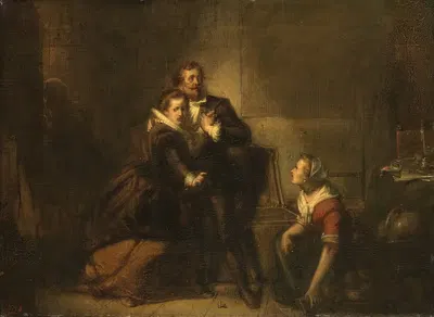
Vrouw bij een waslijn (1848 - 1888)
Anton MauveFor your project
- Source and licence confirmed before use
- Print-ready master at your wall size
- Adapted to your format and palette on request
Provenance / Rights
- Rights
- Public domain (artist died 1888)
SPECIFICATIONS
- Artist
- Anton Mauve
- Category
- Figurative
- Year
- 1848 - 1888
- Nationality / school
- Dutch
- Lifespan
- 1838–1888
- Orientation
- Landscape
- Material
- Digital JPEG + PDF files
- Available sizes
- Print-ready master at your wall size, on request
ABOUT THE ARTWORK
This page presents "Vrouw bij een waslijn" (1848 - 1888), created by Anton Mauve. About the period around 1848 - 1888: Landscape gained new prestige through groups such as the Barbizon painters in France and the Hudson River School in the United States, and by mid-century Realism turned to ordinary people and everyday labour. The first half of the nineteenth century moved from Neoclassicism to Romanticism, which placed emotion, nature, and the sublime at the centre of painting. The catalogue places it in Figurative. The format is landscape. Figurative in brief: Portraits, group scenes, studies of the nude, and pictures of daily life all belong to figurative art. Over the centuries, painters have used the figure to express social standing, narrative, and emotion.
Buying "Vrouw bij een waslijn" means getting a digital file, not a physical print: Digital JPEG + PDF files, 300 DPI, delivered by email once payment is confirmed. A 300 DPI file is intended for printing at home or at a local print shop, where you can choose a matte, satin, or fine-art paper to suit the room. A landscape format suits wide, low wall spaces such as the stretch above a bed, mantel, or sideboard. Figurative works draw attention to the human presence, the gesture, and the emotional tone, so they work particularly well as a standalone focal point in living rooms, studies, and bedrooms. A simple frame with a mat often helps an image settle comfortably into a room. Screens and printers render colour differently, so a small test print is a sensible way to check tones before committing to a large size. Matte and fine-art papers reduce glare in bright rooms, while glossy papers give stronger contrast and deeper blacks. Choosing a standard frame size and printing to fit it often saves the cost of custom framing.
ABOUT THE ARTIST
Dutch, 1838–1888
If you like the visual language of Anton Mauve, explore more works by the same artist in our collection.