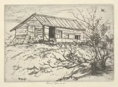

Gezicht op onbekend kasteel (1770 - 1818)
Johan Antonie KaldenbachFor your project
- Source and licence confirmed before use
- Print-ready master at your wall size
- Adapted to your format and palette on request
Provenance / Rights
- Rights
- Public domain (artist died 1818)
SPECIFICATIONS
- Artist
- Johan Antonie Kaldenbach
- Category
- Landscape
- Year
- 1770 - 1818
- Nationality / school
- Dutch
- Lifespan
- 1760–1818
- Orientation
- Landscape
- Material
- Digital JPEG + PDF files
- Available sizes
- Print-ready master at your wall size, on request
ABOUT THE ARTWORK
Dated 1770 - 1818, "Gezicht op onbekend kasteel" is an artwork by Johan Antonie Kaldenbach. It is listed in the Landscape collection. The image is in landscape orientation. Landscape, a short history: Painters have used landscape to study light, weather, season, and the relation between people and place. Landscape became an independent genre in European painting in the sixteenth and seventeenth centuries, while in East Asia it had long been central to ink painting. About the period around 1770 - 1818: In Japan, ukiyo-e woodblock printing flourished in the Edo period and made colour prints a popular and affordable art form. The Enlightenment and the habit of the Grand Tour fed a wider interest in science, travel, antiquity, and natural history, and illustrators accompanied many expeditions.
"Gezicht op onbekend kasteel" is offered as a printable file (Digital JPEG + PDF files, 300 DPI) rather than a shipped item. You receive the files by email after payment and handle printing yourself, which gives you full control over paper, size, and finish. A landscape format suits wide, low wall spaces such as the stretch above a bed, mantel, or sideboard. Landscape scenes add depth and a sense of air to the room, helping the space feel more open and working especially well above a sofa, console, or desk. Measuring the wall before choosing a size is the simplest way to avoid a print that feels too small or too large. Matte and fine-art papers reduce glare in bright rooms, while glossy papers give stronger contrast and deeper blacks. Choosing a standard frame size and printing to fit it often saves the cost of custom framing. Screens and printers render colour differently, so a small test print is a sensible way to check tones before committing to a large size.
ABOUT THE ARTIST
Dutch, 1760–1818
If you like the visual language of Johan Antonie Kaldenbach, explore more works by the same artist in our collection.