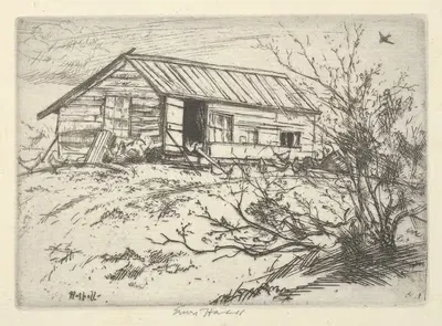
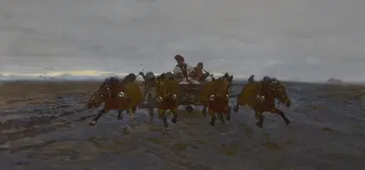
Gezicht in het Doolhof te Volendam. (1950-1965)
Maarten OortwijnFor your project
- Source and licence confirmed before use
- Print-ready master at your wall size
- Adapted to your format and palette on request
SPECIFICATIONS
- Artist
- Maarten Oortwijn
- Category
- Landscape
- Year
- 1950-1965
- Nationality / school
- Dutch
- Lifespan
- 1912–1996
- Orientation
- Landscape
- Material
- Digital JPEG + PDF files
- Available sizes
- Print-ready master at your wall size, on request
ABOUT THE ARTWORK
Dated 1950-1965, "Gezicht in het Doolhof te Volendam." is an artwork by Maarten Oortwijn. Historical background, 1950-1965: After 1945 the centre of Western art activity shifted to New York, where Abstract Expressionism was followed by Pop art, Minimalism, and Conceptual art. Photography, film, and print culture became part of the language of art, and artists across the world developed their own responses to modernism. Background on Landscape: The invention of paint in tubes in the 1840s made it easier to work outdoors, and landscape became a main subject of Romanticism, Realism, and Impressionism. Painters have used landscape to study light, weather, season, and the relation between people and place. It is listed in the Landscape collection. The image is in landscape orientation.
"Gezicht in het Doolhof te Volendam." is offered as a printable file (Digital JPEG + PDF files, 300 DPI) rather than a shipped item. You receive the files by email after payment and handle printing yourself, which gives you full control over paper, size, and finish. A landscape format suits wide, low wall spaces such as the stretch above a bed, mantel, or sideboard. Measuring the wall before choosing a size is the simplest way to avoid a print that feels too small or too large. Choosing a standard frame size and printing to fit it often saves the cost of custom framing. Screens and printers render colour differently, so a small test print is a sensible way to check tones before committing to a large size. Matte and fine-art papers reduce glare in bright rooms, while glossy papers give stronger contrast and deeper blacks.
ABOUT THE ARTIST
Dutch, 1912–1996
If you like the visual language of Maarten Oortwijn, explore more works by the same artist in our collection.