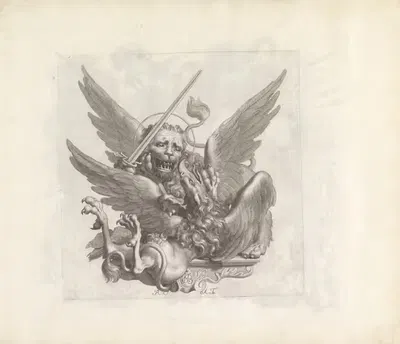
Arbeider schept geld uit de schatkist. Grondige studie (1900-1940)
Patricq KroonFor your project
- Source and licence confirmed before use
- Print-ready master at your wall size
- Adapted to your format and palette on request
Provenance / Rights
- Rights
- Public domain (artist died 1941)
SPECIFICATIONS
- Artist
- Patricq Kroon
- Category
- Illustration
- Year
- 1900-1940
- Nationality / school
- Dutch
- Lifespan
- 1862–1941
- Orientation
- Portrait
- Material
- Digital JPEG + PDF files
- Available sizes
- Print-ready master at your wall size, on request
HELPFUL LINKS
ABOUT THE ARTWORK
This page presents "Arbeider schept geld uit de schatkist. Grondige studie" (1900-1940), created by Patricq Kroon. It is listed in the Illustration collection. The image is in portrait orientation. Illustration in brief: Printing methods such as woodcut, engraving, lithography, and photomechanical reproduction each shaped how illustrators worked. The late nineteenth and early twentieth centuries are often described as a golden age of book and magazine illustration. About the period around 1900-1940: Posters, magazines, and illustrated books were major ways for the public to meet new art and design. The first decades of the twentieth century were a period of rapid experiment, with Fauvism, Expressionism, Cubism, Futurism, and the first abstract painting appearing within a few years of each other.
Buying "Arbeider schept geld uit de schatkist. Grondige studie" means getting a digital file, not a physical print: Digital JPEG + PDF files, 300 DPI, delivered by email once payment is confirmed. A 300 DPI file is intended for printing at home or at a local print shop, where you can choose a matte, satin, or fine-art paper to suit the room. A portrait format suits narrow wall spaces, hallways, and the area beside a door or window. A simple frame with a mat often helps an image settle comfortably into a room. Hang the print away from direct sunlight, which over the years can fade any printed colour. Screens and printers render colour differently, so a small test print is a sensible way to check tones before committing to a large size. Matte and fine-art papers reduce glare in bright rooms, while glossy papers give stronger contrast and deeper blacks.
ABOUT THE ARTIST
Dutch, 1862–1941
If you like the visual language of Patricq Kroon, explore more works by the same artist in our collection.