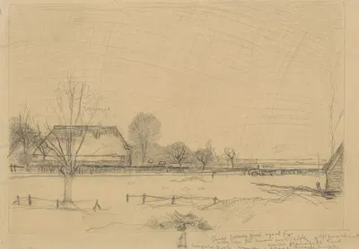
Winterlandschap te Eerbeek, links een knotwilg en een boerderij, rechts een paard en wagen en een hutje
Jan Mankes1900-1920$2.99digital file
Add to cart
Add to wishlist
Digital file
Add 1 more file → next file -5%.
DIGITAL POSTER
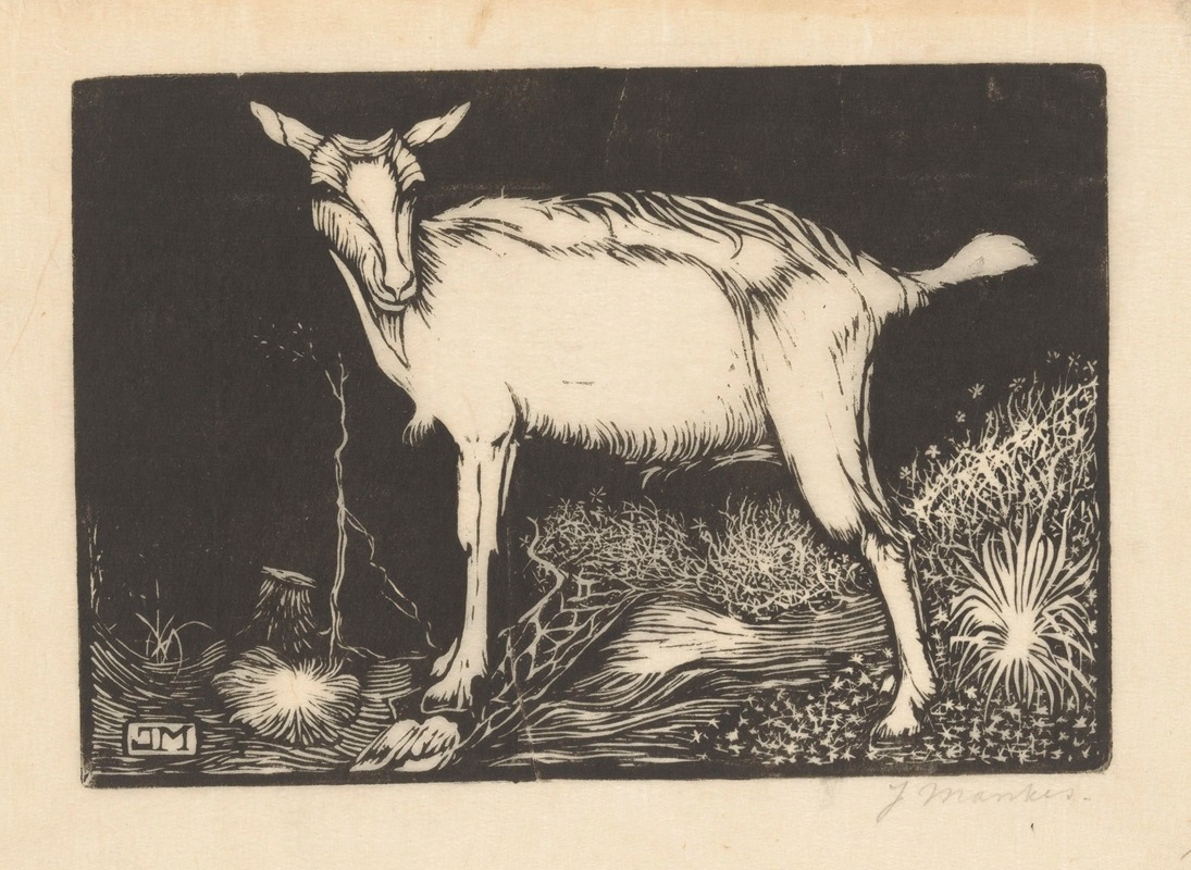
Witte geit
$2.99
This page presents "Witte geit" (1915), created by Jan Mankes. About the period around 1915: Posters, magazines, and illustrated books were major ways for the public to meet new art and design. The first decades of the twentieth century were a period of rapid experiment, with Fauvism, Expressionism, Cubism, Futurism, and the first abstract painting appearing within a few years of each other. Background on Illustration: Illustration serves a text or a story, a tradition that runs from decorated medieval manuscripts to printed book plates, magazines, and posters. The late nineteenth and early twentieth centuries are often described as a golden age of book and magazine illustration. The catalogue places it in Illustration. The format is landscape.
"Witte geit" is offered as a printable file (Digital JPEG + PDF files, 300 DPI) rather than a shipped item. You receive the files by email after payment and handle printing yourself, which gives you full control over paper, size, and finish. A landscape format suits wide, low wall spaces such as the stretch above a bed, mantel, or sideboard. Illustrative graphics are valued for their decorative line work and narrative quality, which makes them a strong fit for gallery walls, kids rooms, studies, and more intimate interiors. Measuring the wall before choosing a size is the simplest way to avoid a print that feels too small or too large. Choosing a standard frame size and printing to fit it often saves the cost of custom framing. Screens and printers render colour differently, so a small test print is a sensible way to check tones before committing to a large size. Matte and fine-art papers reduce glare in bright rooms, while glossy papers give stronger contrast and deeper blacks.
Dutch, 1889–1920
If you like the visual language of Jan Mankes, explore more works by the same artist in our collection.