$2.99digital file
Add to cart
Add to wishlist
Digital file
Add 1 more file → next file -5%.
DIGITAL POSTER
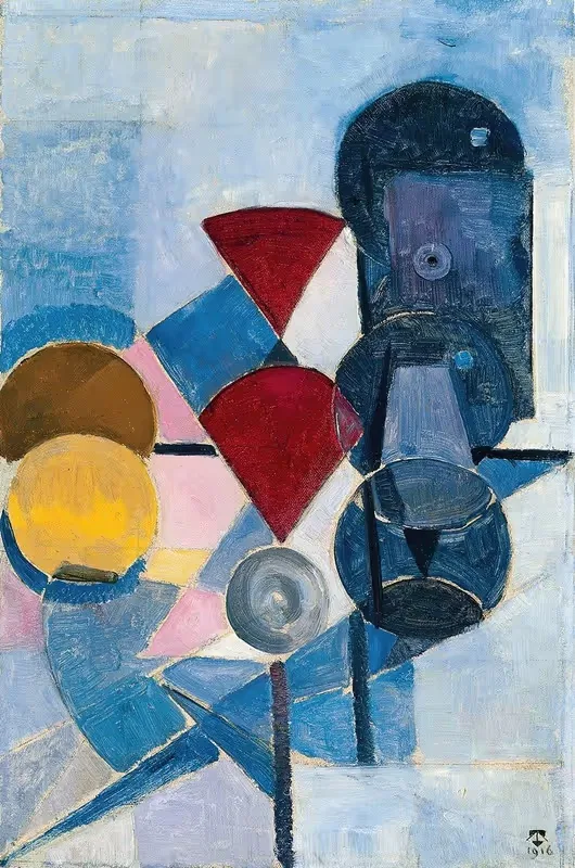
Composition II (Still Life)
$2.99
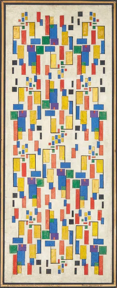
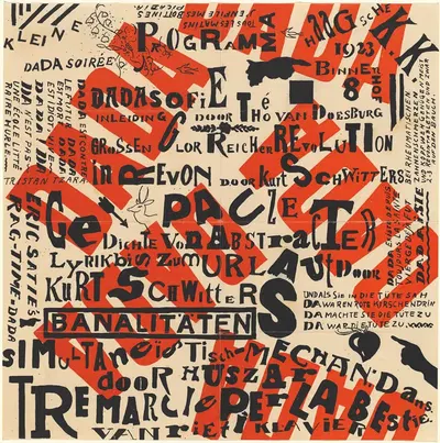
This page presents "Composition II (Still Life)" (1916), created by Theo van Doesburg. Abstract, a short history: It emerged in the early twentieth century, when several artists in Europe and Russia developed non-representational painting during the 1910s. Movements of later decades, including Abstract Expressionism and geometric abstraction, carried non-representational ideas into new scales and materials. About the period around 1916: Dada and Surrealism followed the First World War, the Bauhaus school was founded in 1919, and Art Deco became the fashionable decorative style of the 1920s and 1930s. Posters, magazines, and illustrated books were major ways for the public to meet new art and design. The catalogue places it in Abstract. The format is portrait.
Buying "Composition II (Still Life)" means getting a digital file, not a physical print: Digital JPEG + PDF files, 300 DPI, delivered by email once payment is confirmed. A 300 DPI file is intended for printing at home or at a local print shop, where you can choose a matte, satin, or fine-art paper to suit the room. A portrait format suits narrow wall spaces, hallways, and the area beside a door or window. Abstract compositions work through rhythm, colour, and form, which makes them especially effective in modern interiors and in spaces that need a strong visual accent without a literal narrative. A simple frame with a mat often helps an image settle comfortably into a room. Screens and printers render colour differently, so a small test print is a sensible way to check tones before committing to a large size. Matte and fine-art papers reduce glare in bright rooms, while glossy papers give stronger contrast and deeper blacks. Hang the print away from direct sunlight, which over the years can fade any printed colour.
Dutch, 1883–1931
If you like the visual language of Theo van Doesburg, explore more works by the same artist in our collection.