$2.99digital file
Add to cart
Add to wishlist

Digital file
Add 1 more file → next file -5%.
DIGITAL POSTER
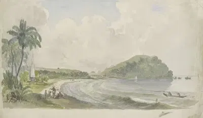
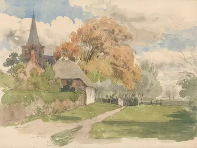
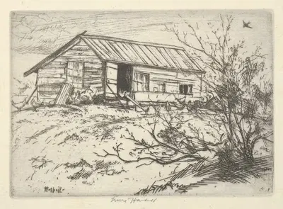
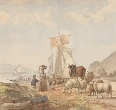
Beboste kust van een meer
$2.99
Dated 1845 - 1925, "Beboste kust van een meer" is an artwork by Julius Jacobus van de Sande Bakhuyzen. Landscape, a short history: Landscape became an independent genre in European painting in the sixteenth and seventeenth centuries, while in East Asia it had long been central to ink painting. Painters have used landscape to study light, weather, season, and the relation between people and place. About the period around 1845 - 1925: The first half of the nineteenth century moved from Neoclassicism to Romanticism, which placed emotion, nature, and the sublime at the centre of painting. Landscape gained new prestige through groups such as the Barbizon painters in France and the Hudson River School in the United States, and by mid-century Realism turned to ordinary people and everyday labour. It is listed in the Landscape collection. The image is in landscape orientation.
"Beboste kust van een meer" is offered as a printable file (Digital JPEG + PDF files, 300 DPI) rather than a shipped item. You receive the files by email after payment and handle printing yourself, which gives you full control over paper, size, and finish. A landscape format suits wide, low wall spaces such as the stretch above a bed, mantel, or sideboard. Landscape scenes add depth and a sense of air to the room, helping the space feel more open and working especially well above a sofa, console, or desk. Measuring the wall before choosing a size is the simplest way to avoid a print that feels too small or too large. Screens and printers render colour differently, so a small test print is a sensible way to check tones before committing to a large size. Matte and fine-art papers reduce glare in bright rooms, while glossy papers give stronger contrast and deeper blacks. Hang the print away from direct sunlight, which over the years can fade any printed colour.
Dutch, 1835–1925
If you like the visual language of Julius Jacobus van de Sande Bakhuyzen, explore more works by the same artist in our collection.